Manually Enhancing Normal maps generated from images or photographs
Normal maps generated from images, photographs or other artwork often appear lacklustre due to the fact that conversion makes use of two-dimensional pixel data rather than three-dimensional structure (models), an aspect of the process that’s especially apparent with organic or irregularly shaped objects like rock. Having said this however, with judicial use of "blur" filtering and simple layering, it is possible to partially address the problem by editing and manipulating Normal maps directly.
The following runs through this process, of editing a Normal map to ‘boost’ its RGB colour values, ‘enhancing’ the appearance of broader structure and depth without causing undue stress to the underlying image.
A basic understanding of image manipulation is useful but not specifically required to achieve the best from the below.
Enhanced Normal Maps
Normal maps generated from photographs or other types of detail-driven artwork tend to lack depth due to the way bitmap data is flattened to be made sense of, and so the resulting grey-scale values have meaning relative to the implied height and depth of what’s supposed to be represented (as the viewer understands it). This typically results in maps with a fair degree of surface detailing but little beyond that in terms of broader more meaningful structure, i.e. a typical conversion might give a good impression of a surface being rough but not necessarily that being the surface of a particular type of structure.
Design note: image converters and filters deal with pixels and colour/tonal values not structure, as would be the case texture baking high-resolution 3D models. This inherently necessitates that strong contrasts, at both the high and low end of the tonal range, be removed or reduced to prevent improper interpretation of structure, i.e. that dark shadows are not interpreted as depth, highlights or bright reflections not being seen as height.
The grey-scale image used to generate the Normal map for this tutorial for example is a rock face. This can be said to be ‘known’ because the viewer has a general sense what rock is supposed to look like so inspects the image for ‘markers’ that confirm (or refute) the assumption – cues to the structure of the object, the type of surface represented and numerous macro details such as cracks and indentations. Whilst the viewer, typically a human, understands what these are, i.e. their context and meaning, to an image editor and/or Normal map filter they are simply differing tones of grey. In other words context and meaning are lost in conversion. However, knowing this it’s possible to inject both context and meaning back into the Normal map through image blurring.
Design note: although "blur" tends to be referenced using slightly different names depending on the image editor used, they are all based on the same principle of blurring image/bitmap data by a given tolerance measured in pixels.

The cues or markers that indicate to the viewer what an image is supposed to represent are meaningless to image editors and Normal map filters beyond their being grey-scale pixels
Prerequisites
The technique explained below relies on the availability of a Normal map rather than doing anything special to a grey-scale source image beforehand. However, for best results the map used should be as clean and correct as possible, meaning it should be of even tone, absent ‘noise’ or other forms of interference to avoid too much (surface) aberration in the primary Normal map produced. It’s also crucial the image tile left-right, up-down properly to prevent the introduction of edge artifacts that may be difficult to remove later.
Design note: more details on making a normal map from an image or photo and how NOT to make Normal maps available here. To summarise; use contrast and brightness tools to narrow the range of grey-scale tones to remove areas that are too white – which protrude, and those that are too dark – which recede; use noise or moire tools to remove excessive or obvious pixellation or patterns, flattening surfaces so they are less variable. In other words, darker colours should represent depth rather than merely being dark-green paint or shadows et al.

Baseline Normal map which will be used to enhance itself (shown in nJob)
Enhancing Normal Maps
Enhancing Normal maps works because the technique takes advantage of the way RGB colour values are interpreted and the way differing colour biases equate to depth and height; when these values are blurred and spread over a larger area the distribution of colours equate to a similar structural interpretation of the map. If this is done to a number of iterations of the same original image, blurred to differing levels then layered together, a map can be produced that’s far more effective at representing something approaching genuine structure as well as surface detailing in an image that would otherwise be lacking such detail.
Design note: the number of iterations, and the levels at which they can be blurred, will vary depending on the structural demands of the final image; organics tend to require more levels and broader blurring than man-made structures due to the random nature of the former versus the latter. Care should be taken to not ‘blow-out’ the Normal map however.

For illustrative purposes, and to make the differences between layers easier to distinguish, the Normal map is zoomed in to focus on the top-right section, filling the screen
![]()
The original Normal map generated from the grey-scale image using nJob; colours are relatively uniform and within a narrow(ish) range, which is preferable to prevent ‘blow-out’ where colours are boosted to far towards ‘white’ when layered (to be avoided)
With a Normal map open in an image editor, copy/paste or duplicate it at least four times then apply to each a single specific level of blur, i.e. one image blurred at "1" pixel, another at "3", a third at "5" and fourth at "10" pixels. This creates a set of images that equate to "super", "fine", "medium", "large" levels of enhancement. This is the base set of layers.
Design note: that’s four separate images; image one assigned a "1" pixel blur, image two a "3" pixels, image three at "5", and finally image four blurred to "10" pixels – blur levels are relatively arbitrary and based on the physical size of the image; "10" is used here because beyond that, blur is so great that detailing becomes too indistinct to be useful for purpose.
The original image is duplicated and given a 1 pixel blur (called "Gaussian Blur" in Corel PhotoPaint) – each level is generated from the original image rather than ‘compounding’ an iteration to ensure full control over the result, i.e. blurring an image that’s already been processed (blurred) tends to compound the result – a 5 pixel blur of an image carrying a 3 pixel blur produces something akin to a 10 pixel blur
![]()
… given a 3 pixel blur a lot of fine detail starts to dissolve …
![]()
… a 5 pixel blur results in most small detail being lost whilst leaving medium structures visible…
![]()
… and finally a 10 pixel blur which makes the resulting colour dispersion quite indistinct, any more than this an the layer may not be of much use, only very diffuse board colour change is visible
Combining Blurred Layers
With a set of base layers or objects available they next need to be mixed so each has an effect on others in a particular way. This is done by setting the blend mode (or merge mode) for each layer in the stack to "Overlay" (except the background / original image). What this does across several layers, is compound lights and darks whilst leaving mid-tones reasonably unaffected. In other words "Overlay" causes certain colours and areas to become stronger, the combined difference making these areas appear more pronounced, whilst having a lesser affect on the broader colour range of the overall image (over-brightening or darkening).
Design note: some image editors refer to "Blend Mode" as "Merge Mode", which is not to be confused with ‘merging’ a stack to collapse layers together. Similarly "Layers" are referred to as "Objects" in some editors. The "Overlay" blend mode typically modifies contrast extremes, the lights and darks of an image, whilst leaving the mid-tones unchanged. For Normal maps this has the effect of boosting colours at what is effectively the ‘high’ and ‘low’ end of the colour range without modifying the overall tone of the image. This similarly boosts structures those same modified colours represent / are associated with.
Depending upon the strength of effect wanted, once the basic stack has been set up, individual layers can then be copy/pasted or duplicated to further boost a given level of blur, or reduced by altering layer “Opacity“.
Design note: two layers with 1 pixel blur increases the intensity of that level of detail, or it can be reduce by altering how transparent the layer is relative to others in the stack. Additionally note that it may be necessary to add more layers with high levels blurring to compensate for the loss of detail, i.e. using four iterations of a layer with a 10 pixel blur to boost the indistinct shapes and colours of that level.

The base layers are ‘merged’ or ‘blended’ together using "Overlay" and either duplicated to enhance, or made less opaque to reduce, the overall effect of the combined layers, this boosts some areas whilst leaving others relatively untouched
Individual layers progressively added to the overall image showing their cumulative effect (note that video compression and size may make the difference between each layer difficult to observe)
Normals can then be further enhanced by flattening the entire image (fully collapsing or merging layers together) into a single instance that can itself be copy/pasted and used as another layer similarly blended using "Overlay".
Design note: save a version of the working file then flatten either as a separate image which is opened into the layered file, or simply copy/paste into place.

Blending the layers with a copy of the flattened image, further boosting the effect that might not otherwise be possible using independent layers
Conclusion
Enhancing Normal maps using blurred layers is a relatively simple way to add depth using tools and techniques the artist may already be familiar with. Although applied universally in the above for clarity in explaining the approach, it doesn’t need to be used in this way as doing so tends to run the risk of blowing out or over-emphasising smaller features at the expense of larger, making the result undulate more than it perhaps should. Instead, with judicial use of masks and image editing, sections can be cut and shaped selectively to emphasis specific features, lending more realism to the final product.
Design note: images should be re-normalised before use to make sure they contain valid RGB normalised colours only.

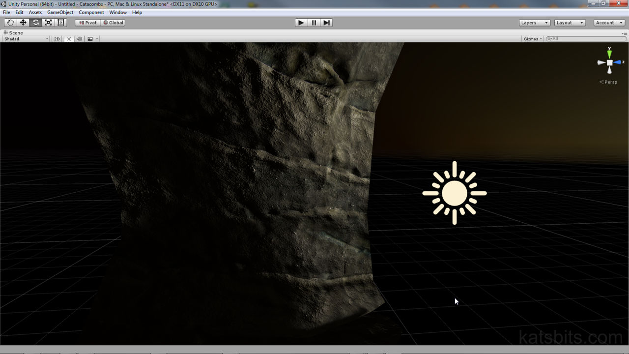
Shown in Unity assigned to a simple rock structure, the default Normal map tends to provide a lot of surface detailing (roughness of the rock) but little sub-structure information…

… whereas once enhanced, normals boost certain features in addition to leaving surface information intact – care should be taken though to edit the images avoid over-emphasis (when tends to make surfaces undulate)
The final result shown in Unity and the difference between the enhanced (first) and default normal map and their respective influence over the objects appearance

